Sign In App
A visitor management single page application built using the vue.js ecosystem.

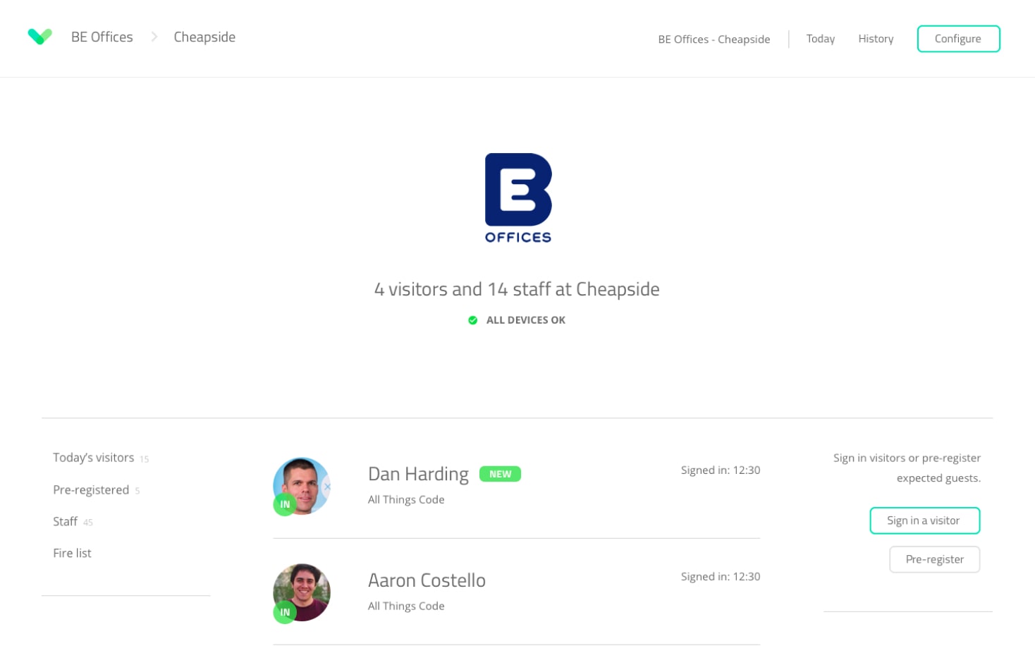
I was lucky enough to join AllThingsCode (a web development agency based in Northampton, UK) right when they decided to get serious about their own SaaS product called SignInApp. SignInApp is a visitor management application, or simply put, a secured, digital alternative to visitor books and timesheets.
- Website:
- https://signinapp.com
- My role:
- Sole front-end developer
The problem
The application needed a solid code refactoring. As the app got more and more popular, we focused on delivering new features to keep the momentum going, but in doing so, we neglected the development part of the process. By not paying enough attention to design thinking and code architecture, we quickly went from version 0.x to 1.x finding ourselves struggling to add new features and to maintain the current ones.
The goal
We were planning on a long grooming session so our goal was to clean up the code and rewrite parts of it to make it more manageable and easy to understand. On top of that we wanted to:
- improve the development experience;
- reduce the loading time;
- introduce a design system to boost our productivity.
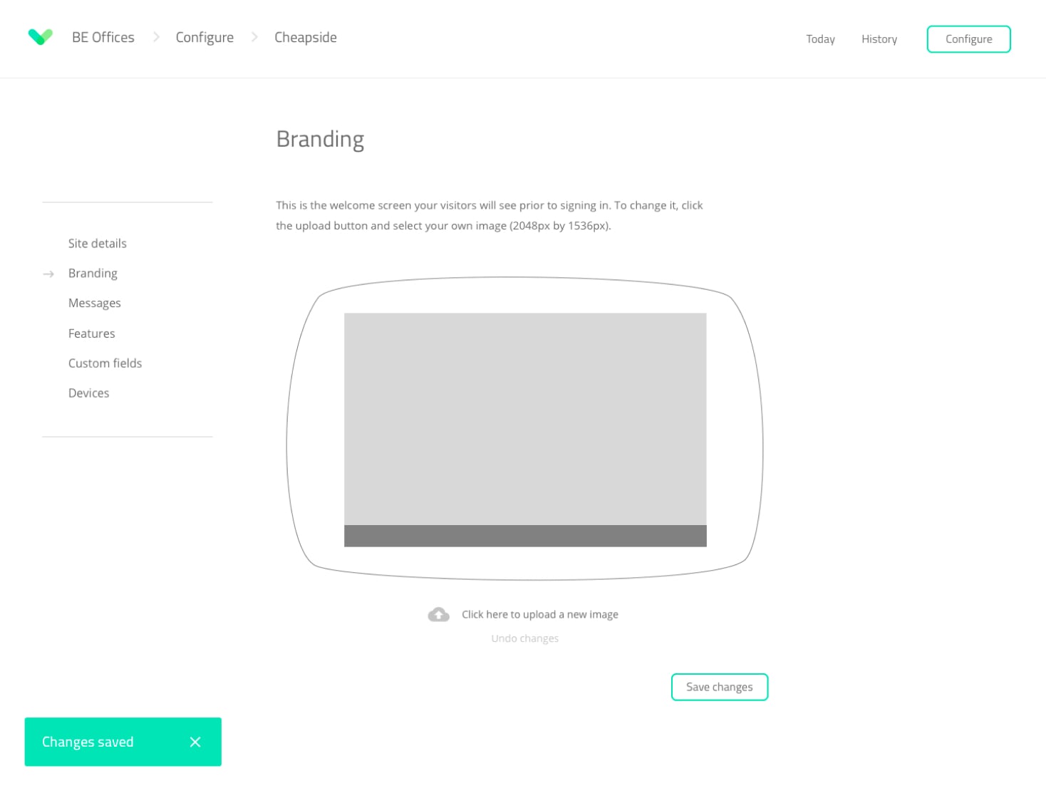
Down below you can see another view of the app (keep in mind that the UI stayed pretty much the same, the real change being underneath).

The challenges
The solid code refactoring we foresaw turned into a complete rewrite which might sound a bit worrying, but it was one of the best things we’ve done and more importantly, one of the most valuable lessons we’ve learned as a team. On the front-end app, the rewrite focused on:
- upgrading vue from 1.x to 2.x;
- introducing vuex (a state management library);
- a slight redesign of the app to support a design system.
The solution
Making long-term architectural decisions as a sole front-end developer on a rapidly growing service product can be a daunting task and I definitely felt the pressure, but it was the good kind of pressure, it allowed me to apply everything I learned up to that moment and I enjoyed every single second of it.
The first thing I’ve done was to work closely with the product owner at that time to get the UI in a place where we can build a design system around it. That meant we had to focus on the consistency aspect of the interface so we had to:
- introduce a spacing strategy (grid);
- revisit the typography;
- use a consistent color palette;
- use consistent form elements and buttons across the app;
- revisit all the user flows.
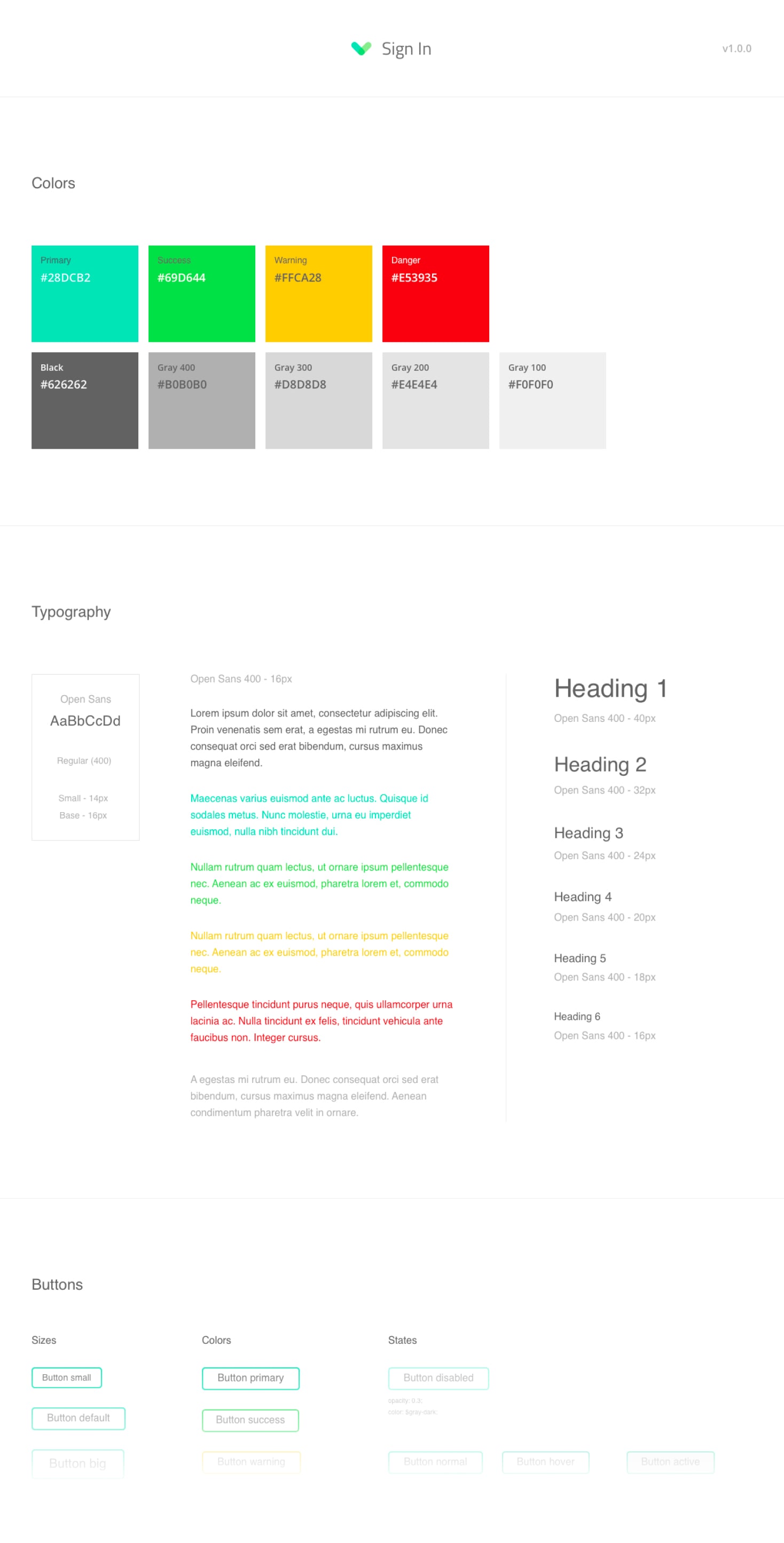
After all of that was done, I got the .sketch files and I started putting together the first version of a style guide that represented the base of the design system we envisioned.

Shortly after, with a list of clear goals, the coding session began.
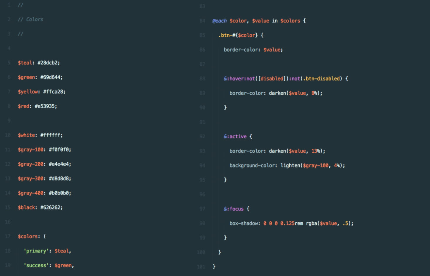
To achieve a CSS codebase that’s small, easy to understand and easy to manage, I chose SASS (a CSS preprocessor) and I used all the power it had to offer (loops, maps, etc).
One of the biggest changes I’ve done was to drop the BEM naming convention. Instead, I introduced a utility classes based approach which ended up being one of the best decisions. It reduced the size of the compiled CSS by almost 50% which meant better loading time, but not only because of the smaller CSS files but also because the app GZIPed a lot better due to the repeating CSS classes in the markup and the CSS code.

Next on the list was taking care of the logic and implement the back-end endpoints. I knew that doing it the old way was a no-go so I installed vuex, a state management library which made the data flow between the components feel like a breeze, no more prop drilling, no more events, just clean, nice and easy to read code.
During the initial phases, vuex felt a bit cumbersome, but once everything was set up, the extra level of abstraction it introduced started showing its benefits and implementing new features became a natural, easy process. Easy data flow together with a small but evolving design system led us to achieve our last goal of improving the development experience.
The conclusion
The rewrite was worth it, not only because we enjoyed it but also because our plan worked. Adding new features became an incredibly smooth process. Most of the times we didn’t have to add any new CSS because of the utility classes, we didn’t have to write extra HTTP requests because the data was already in the vuex store and we didn’t have to worry about the look and feel of the new features because of the design system and style guide we put together.
We are proud of this rewrite, not because we’re happy with the result but because of the lessons we’ve learned along the way. This technical challenge allowed us to become better project managers, planners, architects, and designers. It’s experiences like this that make the difference between a junior and a senior developer and not the actual technical skills.
Massive thank you to Dan Harding and Chris Burton for allowing me to be part of the team.